


You may also like
-

Dollar bicycles Poster
Michel Liebeaux · 1922 · Bold poster with a cyclist racing through a glowing yellow circle
Poster from €9 · Framed from €16
-

Royal-Fabric bicycle Poster
Michel Liebeaux · 1922 · Vintage bicycle poster with a climbing rider and Royal-Fabric lettering
Poster from €9 · Framed from €16
-

Achtung Möve Poster
J. & Co. Aberle · 1902 · A bicycle poster shows a pale-suited cyclist against deep green and vivid yellow
Poster from €9 · Framed from €16
-

Cycles La Torpille Poster
Michel Liebeaux · 1923 · A bicycle poster with floral wit and strong Art Deco color
Poster from €9 · Framed from €16


-

"Very nice Posters. The quality is amazing and we received it very quickly !"
-

"A shop to visit absolutely. Huge selection of posters. We spent more than an hour there !"
-

"Perfect to find gift. Price are very good. An they can frame and pack it on site"
About the Artist
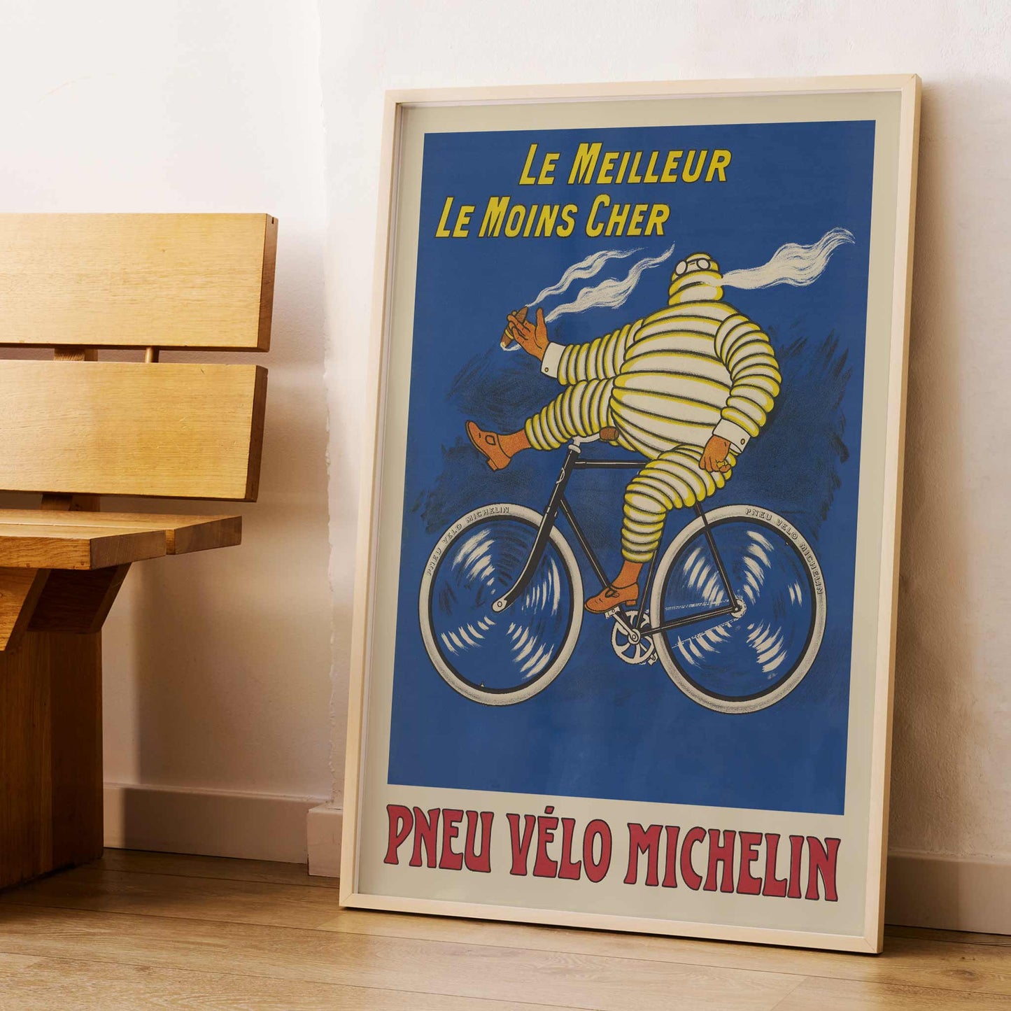
Marius Rossillon, known by the name O Galop, is the artist behind this 1908 Michelin advertising poster. His career in commercial illustration found an enduring subject in Bibendum, the tire figure he helped establish for the Michelin brand. Rather than treating a bicycle tire as a technical object, Rossillon gave the campaign a comic protagonist whose body is made from the product itself. That choice explains the unusual warmth of this vintage print: the company name arrives through a character with a clear gesture and personality. For collectors of French poster art, Rossillon connects Belle Époque graphic design with the early history of branded advertising.
The Artwork
Michelin made this bicycle advertisement to turn a practical purchase into a direct promise for riders. The headline translates as The best, the cheapest, while the lower wording identifies the product as a Michelin bicycle tire. In 1908, this language placed value beside technical confidence, inviting the buyer to see Michelin as a sensible choice for everyday cycling. Bibendum carried the brand message beyond a specification sheet, helping a tire company speak in a memorable human register. Today, the piece reads as a vintage poster from the moment cycling became a visible part of modern commercial culture. Its purpose remains clear: sell a tire by making trust entertaining.
Style & Characteristics
Blue dominates the field, giving the pale, banded Bibendum a strong silhouette. His segmented body repeats the circular language of the tires, while orange-red shoes and gloves punctuate the figure. One raised hand lifts beside his head, and pale streams trail behind him, adding motion without requiring a landscape. The bicycle is drawn in dark lines with large cream-rimmed wheels filled by energetic white strokes. Yellow uppercase lettering occupies the top; red lettering fills the cream panel below. This vertical poster has the punch of graphic advertising, yet the hand-drawn marks keep it human. The result is wall art for close viewing.
In Interior Design
Place this vintage poster in a bright apartment hallway, above a narrow oak bench where daylight can reach its cream border. A black frame would echo the dark bicycle lines and let the blue field carry the room, while the red lower lettering introduces a measured accent against white plaster. The vertical format can fill a tall strip of wall without demanding a large footprint. In that setting, the cyclist brings a touch of Belle Époque history to home decor, and the strong typography gives the passage a clear visual anchor. This art print also suits interior decoration built around one graphic statement rather than a crowded gallery arrangement.